Digital Creative Lead - UX Strategy, Design, Interaction, Illustration
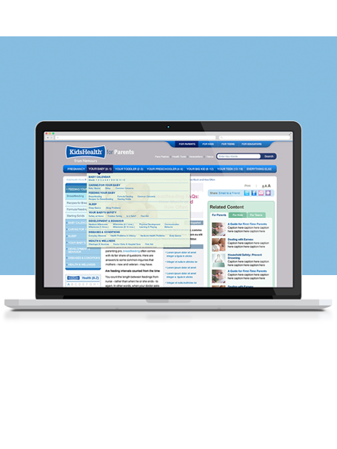
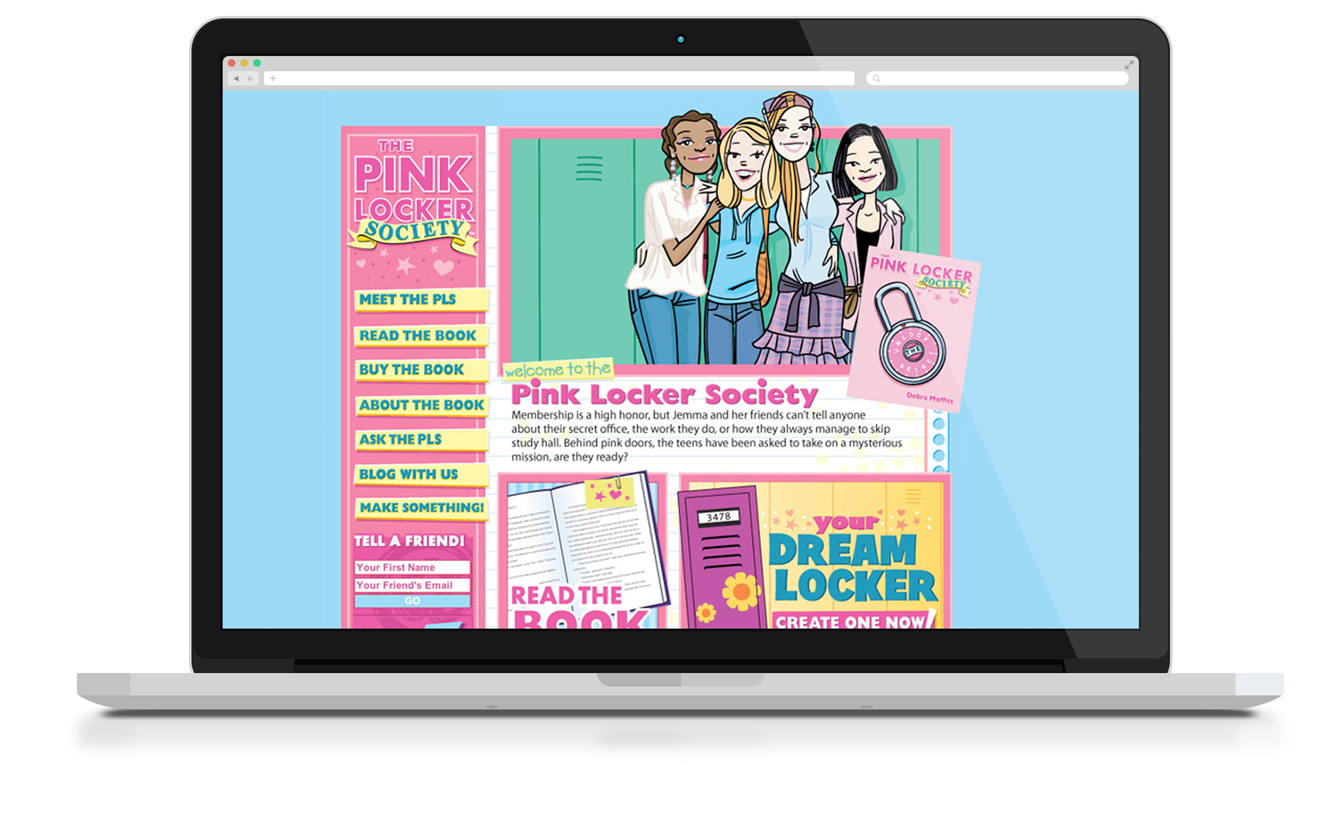
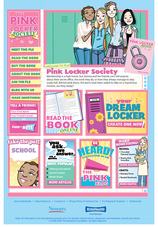
KidsHealth asked me to design the brand for one of their side projects, The Pink Locker Society. The idea was to make it fun and appealing to girls (but not too cutesy), while making the accompanying website informative, yet very interactive.Working closely with book's author Debra Moffitt, I created a website that resembled a scrapbook kind of feel. On the home page (pictured below) we created everything in their own little sections. I thought it would be an easy way to swap out things that were not working and also move things around from time to time to keep the page looking refreshed.
Tried to keep this page, and all the accompanying pages, very visual so when kids came to the site they would stay awhile. The design worked well because from launch to months later the average viewer landing on the site stayed 4-5 minutes and would go 3-4 deep.
Below are other examples from the site and branding I put into this project.
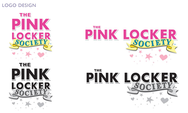
The logo was a little challenging at first. KidsHealth needed it to fit in a thin vertical space while also a minimal height horizontal space.
Since the title itself, is very lengthy, I decided to go with two logo treatments that stayed consistent enough to know it was the same brand. The combination of these two versions of the logo worked throughout every situation design and marketing encountered.
Since the title itself, is very lengthy, I decided to go with two logo treatments that stayed consistent enough to know it was the same brand. The combination of these two versions of the logo worked throughout every situation design and marketing encountered.
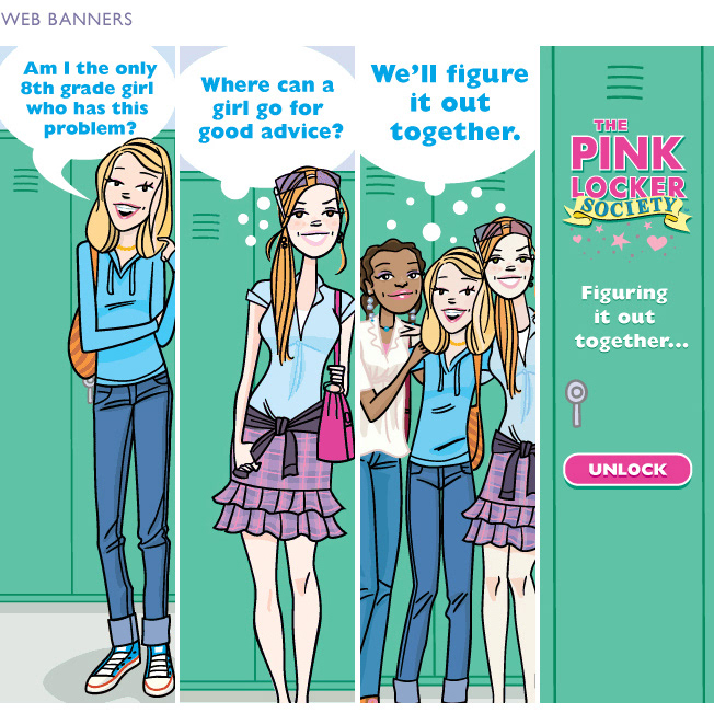
Working with illustrator Chuck Gonzales, myself, along with the design department created the look and feel of the gals (Kate, Jemma, Piper, Bet) to be used throughout the campaign and marketing materials. Above are 3 different web banner designs that were created to run on Kidshealth.org.
The characters seemed to attract attention because, in the first month alone, we had over 300,000 visitors from Kidshealth.org to pinklockersociety.org because of these banners.
The characters seemed to attract attention because, in the first month alone, we had over 300,000 visitors from Kidshealth.org to pinklockersociety.org because of these banners.
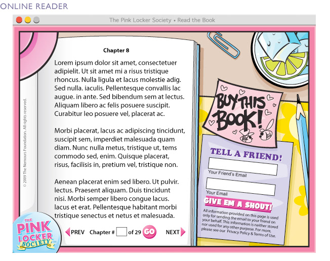
I also designed a pop up component for people interested in the book, before purchasing, could read a couple chapters. Worked closely with freelance flash designers to create the functionality of this feature.
Highlights included a jump to chapter mechanism, turn pages, tell a friend function where you could email alert a friend about the book and a function where clicking the lamp would turn it on and off making the page look dark and light.
Highlights included a jump to chapter mechanism, turn pages, tell a friend function where you could email alert a friend about the book and a function where clicking the lamp would turn it on and off making the page look dark and light.
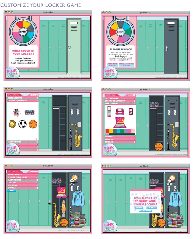
I also designed a pop up game with the idea in mind that kids can design/customize their own digital lockers. Working with other illustrators and freelance flash designers we created over a hundred vector items that could be mixed and matched for customization using a drag and drop functionality.
Overall, the site and book were a hit. St. Martin's Press acquired the property and the book and website has been relaunched. The site went through a style change but since I was more involved in the original version, I thought I would feature this, instead of the new one.
Overall, the site and book were a hit. St. Martin's Press acquired the property and the book and website has been relaunched. The site went through a style change but since I was more involved in the original version, I thought I would feature this, instead of the new one.
If you would like to discuss this, or any other projects on this site contact me directly and let's chat!